Day 3 - Media querie and responsive websites
Media queries
With the help of media queries we can define diffrent style adapted to diffrent devices ( ex. computer, tablet, phone, smartwatch) using values ex. width, height.
See example code on my github

Interactive example ( resize your browser and look how change background and layout)
body {
    background-color: tan;
    color: black;
}
/* On screens that are 992px wide or less, the background color is blue */
@media screen and (max-width: 992px) {
    body {
        background-color: blue;
        color: white;
    }
}
/* On screens that are 600px wide or less, the background color is olive */
@media screen and (max-width: 600px) {
    body {
        background-color: olive;
        color: white;
    }
}
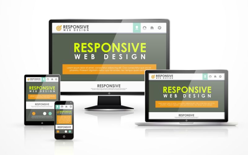
Responsive websites
This is design technique websites so that its appearance nad layout it automatically adjusts to the size of the browser (computer, tablet, phone etc.).
Source Medium