Day 2 - CSS Grid and Flexbox
Grid
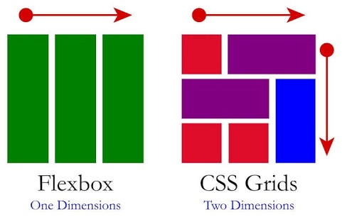
Grid is for multi-dimensional layouts (columns and rows). See example code on my github

Below basics syntax:
grid-column-start: 1 ;
grid-column-end 2;
grid-template-columns; 20% 20% 20%;
grid-template-rows: 20% 20% 20% 20%;
// short version
grid-column: 1 /2;
grid-template-columns: repeat(4, 20%);
grid-template-rows: repeat(4, 20%);
Excellent tutorial about grid
Learn grid basics with funny editor.
Flexbox
Flexbox should be used for one-dimensional layouts - line layouts. Below basics syntax:
justify-content: center;
flex-start: //Elements justify to left side of container.
flex-end: //Elements justify to right side of container.
center: //Elements justify to center of container.
Learn flexbox with funny editor.
Grid vs Flexbox
*Source: *Quora